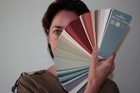
Le Corbusier's original 18 colors formulated for the Villa La Roche in Paris
We received this fabulous gift recently from a loved one returning from Paris. A petite afterthought from a museum gift shop has made our week here at EHD where, as you may have noticed, we think about color a lot. When assigned to write about low VOC paints for 1stdibs we pulled out our numerous fans and laid them out to examine the palettes and how companies chose to present them.
For example, Farrow and Ball has an accordion fold brochure which we leave strewn about the office quite frequently because of the tactile joy of every small square of real paint.
Donald Kaufman's archival boxes full of sumptuous large scale color cards are also a frequent inspiration.
This affinity paint fan from Benjamin Moore was our introduction to their Aura paint line and almost put us off trying the new line just because of the unappealing color adjacencies in this fan.
the "sad-making" Affininty line
Luckily Aura is available in any of the Benjamin Moore colors and can be matched to any color as well (pigment does bring the VOCs up a bit but usually stays well below the off-gassing of a standard paint base.) the "happy-making" Peacock Paint fan - the "satsuma" made many appearances in our projects
We happened upon Christopher Peacock's collection for Fine Paints of Europe when writing about environmentally friendly paints and used their colors here and here.
In addition to our love affair with the newly arrived Corbu palette (which at first seemed random and a little weird and drove us to immediately investigate and fall in love with the Villa) just today we learned that Stark has teamed with "renowned color specialist" David Oliver to present a beautiful range of colors inspired by the London Paint and Paper Library. This pair of accordion fold brochures (they know us so well!) boasts details of the historic roots of the palette as well as the sustainability-minded features of the paint itself. All finishes are "no VOC" and the high gloss lacquer is "low VOC". Pretty impressive. We are currently looking for the perfect application for their "squid ink" - an indescribable green blue black, murky and dense in the best possible way.
Courtesy of Paint and Paper Library, Squid Ink and Moss
Our fascination with this collected ephemera of color cards, paint fans and accordion folded brochures must track back to the inspired hand of the creator. Le Corbusier was guided by a vision of a Parisian villa; the "Polychromie Le Corbusier" fan is a road map of these plans: the pink floor leads to the brown ramp which wraps up to the landings in shades of white and gray so subtle that they seem to be a trick of the light. There is great talent and vision in developing these hand-held testaments to a building, a feeling, a brand, or even an historical era.
Now we just have to think of a sufficiently inspiring thank you for our considerate and oh-so tasteful Parisian traveler.


1 comment:
Thanks for visiting my blog! I'm so with you - the Affinity fan deck doesn't do anything for me, but I do love the Aura paint! If I'm remembering everything correctly, Aura is low VOC but Benjamin Moore's Natura product is zero VOC. Farrow and Ball is zero VOC until you add the colorants which makes it low VOC. And, as you mentioned, Stark is no VOC (except the lacquer). I love having all of these environmentally friendly options!!
Post a Comment